
Excel is a beloved tool for many users and for good reason. It’s flexible, familiar, and powerful enough to handle everything from basic calculations to complex modeling. Most professionals feel comfortable with Excel, and that comfort often leads them to rely on it for all things data related.
However, as data needs continue to grow more complex, Excel can start to show its limitations. Professionals at Forvis Mazars frequently hear from clients who download tables into Excel and sort or filter their data manually. In many cases, they’re trying to answer questions that a dashboard could solve instantly, like identifying top performers or spotting trends, without the need to download anything. This article will explore some differences between Excel and dashboards that users should consider.
The Pain Point: Familiarity vs. Efficiency
There’s a mental block for some users when it comes to dashboards. Excel feels safe. It’s been used for years, and that familiarity builds trust—even when it’s not the most efficient tool for every data-related task. But with large, manually updated spreadsheets, errors can easily go unnoticed. A single altered cell or broken formula buried deep in the file can compromise the integrity of the entire data set.
Another challenge is version control. Many Excel users end up with multiple versions of the same file, such as “Final_v2,” “Final_FINAL,” and “Final_Sept,” because refreshing data is a manual process. This can create confusion and increase the risk of outdated or inconsistent reporting.
Despite its limitations, Excel remains a powerful tool for quick ad hoc analysis, data cleaning and exploration, one-off reports, and sharing data in universally readable formats. These benefits make Excel indispensable, but that same ubiquity can lead users to rely on it for tasks it wasn’t designed to handle.
The Remedy: Dashboards That Work Smarter
Dashboards offer a more scalable, visual, and automated way to interact with data. Scheduled refreshes allow dashboards to pull in updated data at regular intervals, eliminating the need for manual downloads and refreshes.
Dashboards also help users digest information more easily. Even when tables are the best solution, we can enhance them with:
- Groupings by key columns
- Bar charts and heat maps
- Indicators and color coding
- Interactive filters
Here are a couple of examples of how we can enhance traditional tables in dashboards to help improve readability and insight:
 Click here to open image in a new tab
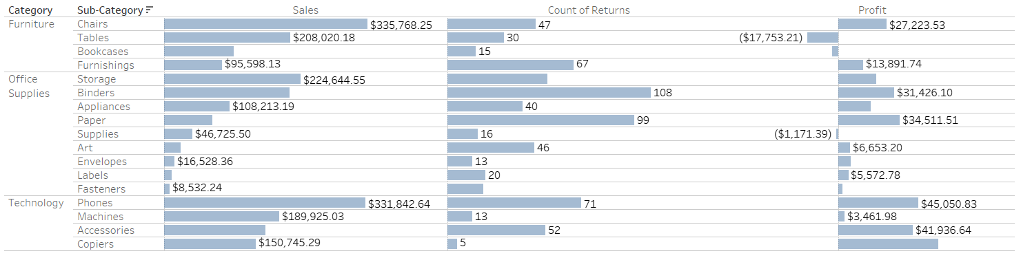
Dashboard Table With Bar Indicators. Bar indicators make it easy to compare performance across sub-categories at a glance, helping users quickly identify top performers and areas of concern without manual sorting.
 Click here to open image in a new tab
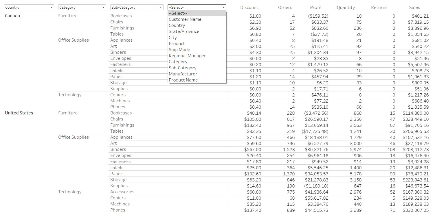
Dashboard Table With Dynamic Grouping. This table organizes data by dimensions the user selects for easier summarization and comparison. Grouping helps users quickly understand patterns across categories without needing to manually sort or restructure the data.
These features make it easier to spot trends, outliers, and performance gaps without needing to “mess with the data” in Excel.
The Value: Better Insights, Less Effort
Dashboards help reduce errors, improve accessibility, and serve as a single source of truth. They’re easier to share and can be tailored to different user roles. When we notice users frequently downloading and manipulating the same data, that’s a signal. We take that as an opportunity to learn what additional insights users are looking for, and build visuals—such as charts and graphs—that provide those insights directly into the dashboard, helping save time and improve usability.
None of this means Excel should be replaced. In fact, our professionals often use Excel as a staging area for dashboard data. But when paired with dashboards, Excel becomes part of a smarter, more efficient workflow.
How Forvis Mazars Can Help
Are you still relying on Excel for tasks that could be automated or visualized? Let’s connect. Our Analytics team can assist you in building a dashboard that helps your team save time, reduce errors, and get more from your data. If you have any questions or need assistance, please reach out to a professional at Forvis Mazars.