
How much data is too much data? Currently, most organizations are capturing overwhelming volumes of data that is difficult to exploit in its raw form. A logical method to help with this challenge is to leverage data visualization, which can offer an in-depth look at the data in a readable, interactive dashboard format. While it can be tempting to feed all available data into dashboards—after all, the goal is to see and understand this data—needing to satisfy every objective in one dashboard can lead to crowded, overly complex views that are not user-friendly.
One way to avoid this pitfall is by focusing on the most critical question(s) (also referred to as “use cases”) and letting these use cases drive the structure, layout, and functionalities of the “views” to be designed.
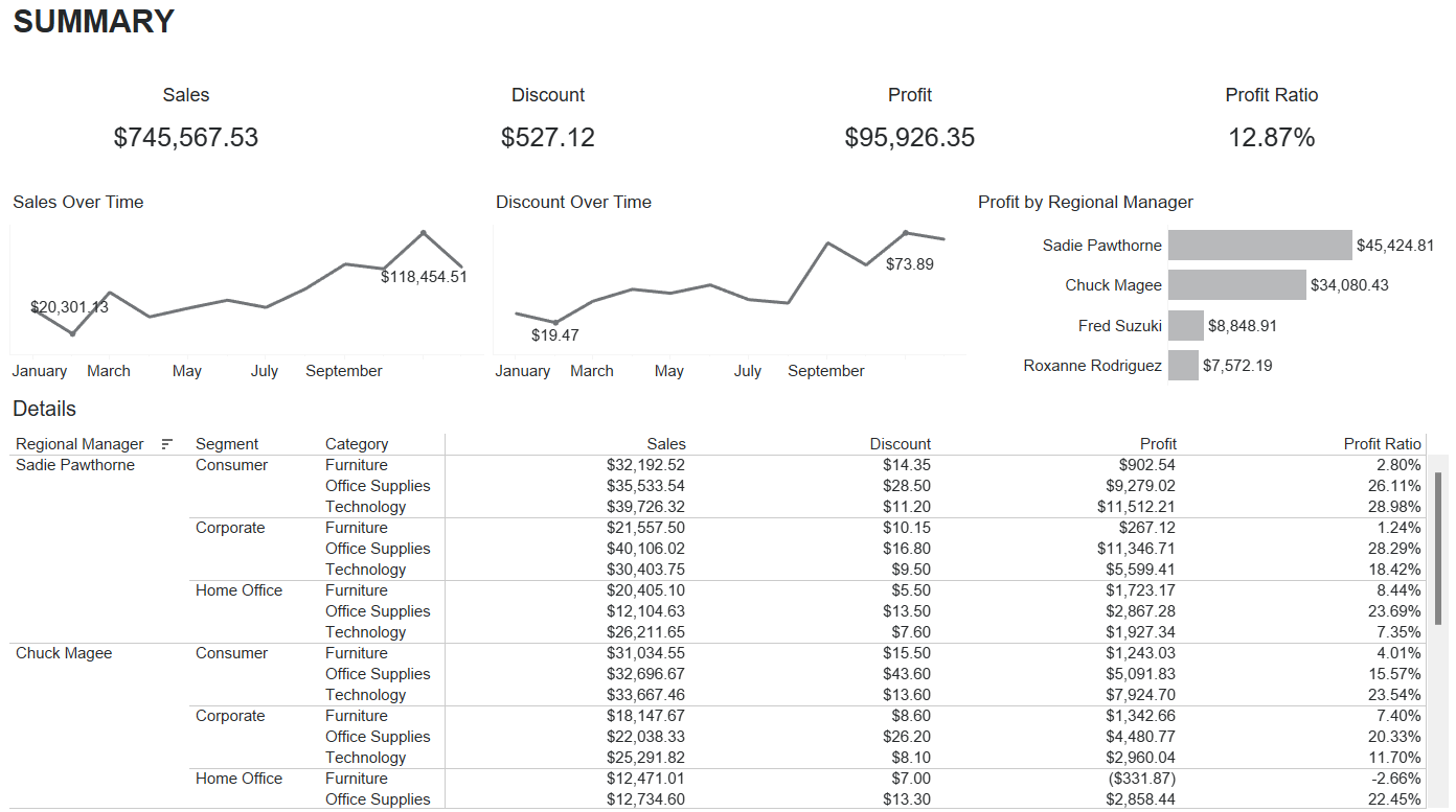
What Are the Main Components & Drivers of Profit?
In the Figure 1 example, the main question for the end-user is, “What are the main components and drivers of profit?” The dashboard shows several metrics from a data source, but it isn’t clear which metrics we should pay attention to or what contributing factors lead to those metrics. A more effective use of the dashboard “real estate” would be to limit how secondary information is displayed and direct the focus on the profit metrics.
Figure 1.
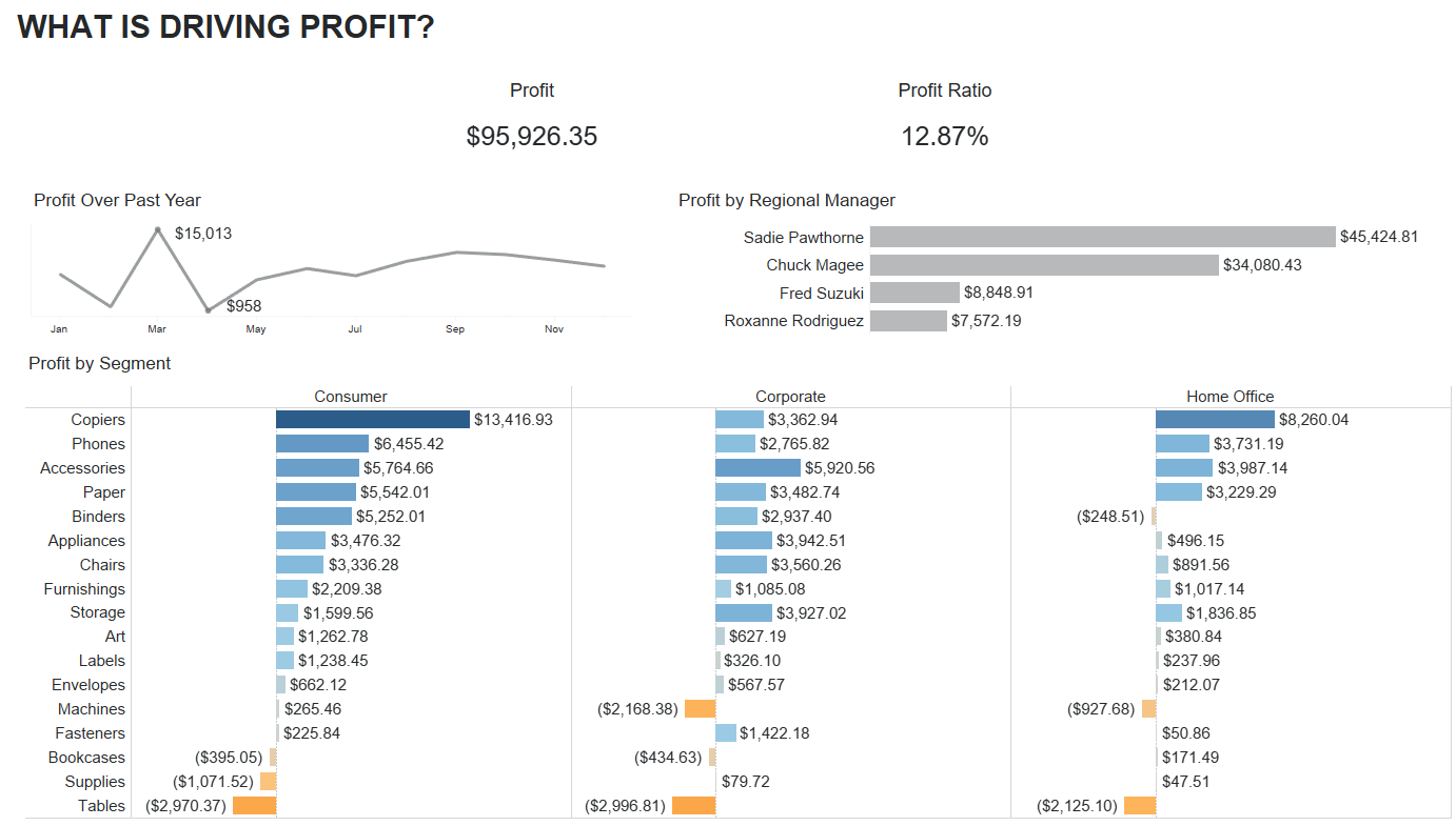
What Are the Main Components & Drivers of Profit?
Taking that into consideration in a subsequent iteration, Figure 2 shows a better version of the same dashboard that keeps the focus on the key metrics (Profit) and removes extraneous or unnecessary information. “Profit” now takes on a more prominent part of the dashboard and not only displays historical trends, but also delivers additional insights such as the overall contributions of Regional Managers, Segments, and Categories. This new iteration of the dashboard does a much better job at answering the original question: “What are the main components and drivers of profit?”
Figure 2.
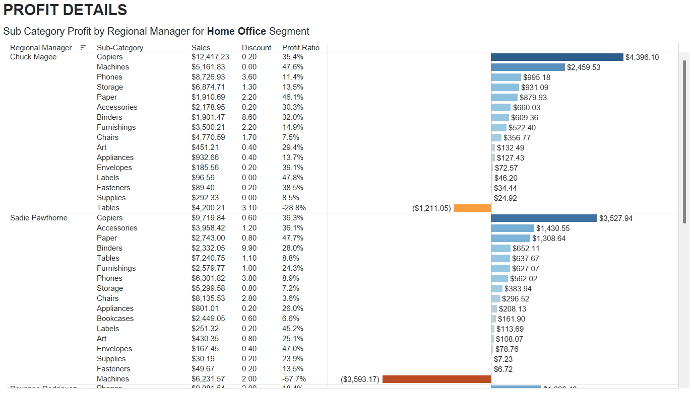
Keeping Figure 2 at a high level allows space to add a supplemental details dashboard. Figure 3 displays the details from the data shown in Figure 2, allowing end-users to “drill down” on their data. This gives them control while also not overloading them with information right away. Figure 3 allows them to understand the data at a higher level, recognizing patterns, and then gives the ability to filter and view the details of their data.
Figure 3.
End-users can gain clarity on the information being generated, with ease and speed of use, and in relevance vis-à-vis their main question(s).
To create effective data visualizations, start with your desired use cases and focus on the question trying to be answered. Avoid the “more is better” trap that inevitably leads to cluttered dashboards that create more questions than answers. Focused dashboards help users quickly understand the data story and compel the user to action.
How Forvis Mazars Can Help You
Our Analytics team is well equipped to support your organization with data visualization and dashboarding tools. If you would like help transitioning your data from database to actionable insights in the form of dashboards, please reach out to a professional at Forvis Mazars.