
One of the common dashboards our Analytics team uses is period-over-period (PoP) comparisons. These dashboards provide a powerful way to gauge and visualize performance across time periods. As part of a broader business intelligence scope, these dashboards can help your organization identify key trends and inform data-driven decision making.
PoP comparisons have helped our clients:
- Identify Performance Drivers
- Highlight Magnitude & Direction of Change
- Reveal Consistency or Volatility
- Spot Red Flags Early
- Drive Strategic Decisions
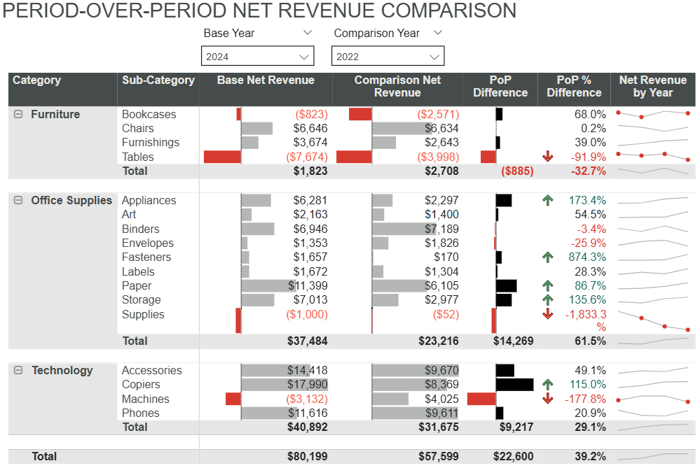
Identify Potential Performance Drivers
The PoP Net Revenue Comparison Matrix is designed to transform raw financial data into clear, actionable insights. It achieves this through a combination of visual features that help make complex data immediately understandable.
By displaying period values side by side with absolute and percentage changes, users can quickly gauge performance trends. The use of preattentive attributes—visual information that allows the human brain to quickly process, such as bars, colors, icons, and sparklines—further enhances the matrix’s readability.
These visual cues allow users to spot patterns, anomalies, and shifts in performance without needing to parse through rows of numbers. For example, sparklines provide a quick visual summary of revenue trends over time, while color coding highlights areas of growth or decline.
This visual design helps reduce cognitive load and enable faster interpretation, making it easier for stakeholders to make informed decisions. Here’s how:
| Insight | What to Look For | What This Helps You Do | So You Can |
|---|---|---|---|
| Identify Performance Drivers | Largest PoP differences, high net revenue, upward-trending sparklines | Pinpoint growth or decline drivers | Focus resources and enhance strategy |
| Highlight Magnitude & Direction of Change | Big dollar and percentage changes, sparkline direction | Understand scale and strength of shifts | Prioritize high-impact areas |
| Reveal Consistency or Volatility | Low PoP % change, flat or gently sloping sparklines | Spot stable vs. erratic performers | Improve forecasting and reduce risk |
| Spot Red Flags Early | Negative PoP differences, steep % declines, erratic sparklines | Detect early signs of issues | Act quickly to protect revenue |
| Drive Strategic Decisions | Patterns of growth, decline, or volatility across categories | Align teams around priorities | Make data-driven decisions |
Next Steps: Turn Insight Into Action
Once you’ve identified what’s driving performance, actions become intuitive, such as:
- Focusing Resources Where They Matter Most: Identify and invest confidently in high-performing areas using clear visual and statistical signals.
- Fixing What’s Broken Before It Escalates: Surface underperformers early to make proactive decisions that help reduce risk.
- Improving Forecasting Accuracy: Use consistent trend analysis and predictive modeling to plan smarter and respond faster.
- Aligning Teams Around What Works: Deploy dashboards that make performance drivers visible across departments.
- Supporting Strategic Decisions With Confidence: Whether scaling a product or reallocating resources, our insights help give you the clarity to act decisively.
This PoP matrix doesn’t just display data; it begins to tell a story. It reveals what’s working, what’s not, and helps you identify next steps. That’s the power of analytics done right.
Ready to Uncover What’s Driving Your Performance?
Let us help turn your data into decisions. Whether you’re just starting with analytics or looking to enhance your existing dashboards, our team is here to help. Contact us to explore how a PoP comparison matrix can bring clarity to your strategy and confidence to turn your insights into action.